TRS Golf — Design system v1.0 · April 2026

TRS Golf
Brand Kit

Contents

Contents.

03
Logo rules
Brand
04
Colour palette
Tokens
05
Colour usage
Tokens
06
Type ramp
Type
07
Casing rules
Type
08
Spacing scale
Layout
09
Corners, borders, shadows
Layout
10
Buttons, pills, badges
Components
11
Pricing pack card
Components
12
Rating & stock
Components
13
Imagery — do & don’t
Brand
14
Brand in action
Reference
15
Files in this kit
Reference
02 / 15
TRS

Logo

Logo rules.

TRS Golf logo
Rectangle 2:1Rectangle · 2:1
Square 1:1Square · 1:1
TransparentTransparent
Master logo: white wordmark with a horizontal red bar beneath. Designed to sit on the brand charcoal (#3E3E3E) or any dark surface. A light-surface (ink-on-white) version is not supplied; don’t recolour the master to fake one.
Files supplied (SVG, vector): assets/trs-logo.svg (transparent) · assets/trs-logo-rect.svg (rectangle, 2:1) · assets/trs-logo-square.svg (square, 1:1).
Don’tRotate or skew the wordmark.
Don’tInvert to ink-on-white. No light-surface master exists.
Don’tPlace on any colour other than charcoal or ink.
Don’tStretch, squash, or recolour the red bar.
03 / 15 — Logo
TRS

Colour palette

Red — our signature

Red
#cf2437
Primary CTA, badges, stars, the red bar in the logo.
Red — Bright
#fc364c
Theme button red (Shopify token).
Red — Dark
#9c1827
1px border under red CTAs.
Red — Tint
#fff8f9
Selected pricing-pack fill.

Black, white & greys — surfaces and text

Ink
#161616
White
#ffffff
Surface 2
#f7f7f7
Surface 3
#f3f3f3

Green & grey — narrow use only

Stock green
#5cd33f
In-stock dot only. Nothing else.
Grey 700
#5f5f5f
Captions and metadata only.
04 / 15 — Colour
TRS

Colour usage

Where each colour belongs.

Red
Primary CTAs, announcement bar, rating stars, badge pills, the red bar in the logo, selected-card border.
Ink
All body and headline text. Dark CTAs (Shop now). Footer surface.
White
Default page surface. Text on red and ink fills.
Surface 2 / 3
Section backgrounds and image placeholders inside cards.
Stock green
In-stock dot only. Nothing else uses this colour.
Red tint
Selected pricing-pack card fill, paired with the 2px red border.
Grey 700
Captions and metadata only. Default body copy stays ink.
No gradients
Backgrounds are always flat solids. Never blend two brand colours.
05 / 15 — Colour usage
TRS

Typography

Aeonik.

H1
TRS Slider
96 / 92 · 500 · −2%
H2
Choose your slider size
64 / 64 · 500 · −2%
H3
Designed by Robert Rock
36 / 38 · 500 · −2%
Body Lg
Designed in collaboration with Robert Rock. Used on tour by Tommy Fleetwood and Cam Smith.
22 / 32 · 400 · 0%
Body
In stock — delivered to you by January 01. 60-day money-back guarantee on every order.
18 / 28 · 400 · 0%
CTA
Add to cart
22 / 22 · 700 · −2%
Eyebrow / Mono
Free shipping on UK orders over £50
Aeonik · 14 · 700 · +16%
06 / 15 — Type ramp
TRS

Casing

One casing per surface.

H1 — Title Case
TRS Slider

Product names and marketing headlines. Set in Aeonik 500.

Body — Sentence case
In stock — delivered to you by January 01.

Default for everything below H1.

CTA — UPPERCASE
Add to cart

Primary actions and capsule badges. Letter-spacing −2%.

07 / 15 — Casing
TRS

Spacing

4px base. 50px section anchor.

Every gap, padding and offset is a multiple of 4. Below: the scale, with the real surface each step belongs to.

4
Hairline gaps. Star-rating dot to text. Stock dot to "In stock" label.
8
Tight pairs. Variant pill internal padding. Grid gutter between product cards.
12
Inline spacing. Icon to label inside CTAs. "Free shipping" eyebrow lockup.
16
Component padding. Inside pricing-pack cards. Between FAQ rows. Header nav-link gap.
24
Stack rhythm. H1 to lede. Lede to first paragraph. Above the Add-to-cart row on PDP.
32
Group separation. Between buy-box and trust list. Above star rating on review cards.
40
Sub-section break. Between pricing packs and variant picker. Pack row top margin.
50
Section anchor. Top & bottom padding on every full-width section (hero, pricing, FAQ, footer).
64
Hero stack. Between hero copy and the buy panel on desktop PDP.
120
Page-level break. Major editorial gap, e.g. between "Designed by Robert Rock" and the trust strip.

Page width: 1340px desktop · 360px mobile design unit.

08 / 15 — Spacing
TRS

Corners, borders, shadows

Square corners. Borders, not shadows.

0px
Default
Inputs, surfaces, cards.
2px
CTA
Primary buttons.
8px
Pricing pack
Pricing cards only.
Pill
Capsule
Variant pickers, badges.

Default border: 1px solid #e4e4e4. Selected: 2px solid #cf2437. The only allowed shadow is --trs-shadow-sm, reserved for sticky/modal surfaces.

09 / 15 — Corners
TRS

Buttons, pills, badges

Three button styles. One pill. Two badges.

Primary CTA
Secondary & dark
Variant pills
Badges
Most popular Best value Save up to 30%
10 / 15 — Buttons
TRS

Pricing pack card

Default, selected, badged.

Default: 1px grey border, 8px radius. Selected: 2px red border, soft-pink fill, capsule badge floating above the top edge.

×1

1 Slider

£129.90 per slider

Most popular
×2

2 Sliders

£103.92 per slider

Save 20%
Best value
×3

3 Sliders

£90.93 per slider

Save 30%
11 / 15 — Pricing
TRS

Rating & stock

Stars and a stock dot.

Rating bar
50,000+ golfers rate this 4.8/5.0

Five red stars. Sits above the H1.

Stock indicator
In stock — delivered to you by January 01

Soft-halo green dot with delivery promise. Sits directly under the primary CTA.

12 / 15 — Rating & stock
TRS

Imagery

Action photography. Product cutouts.
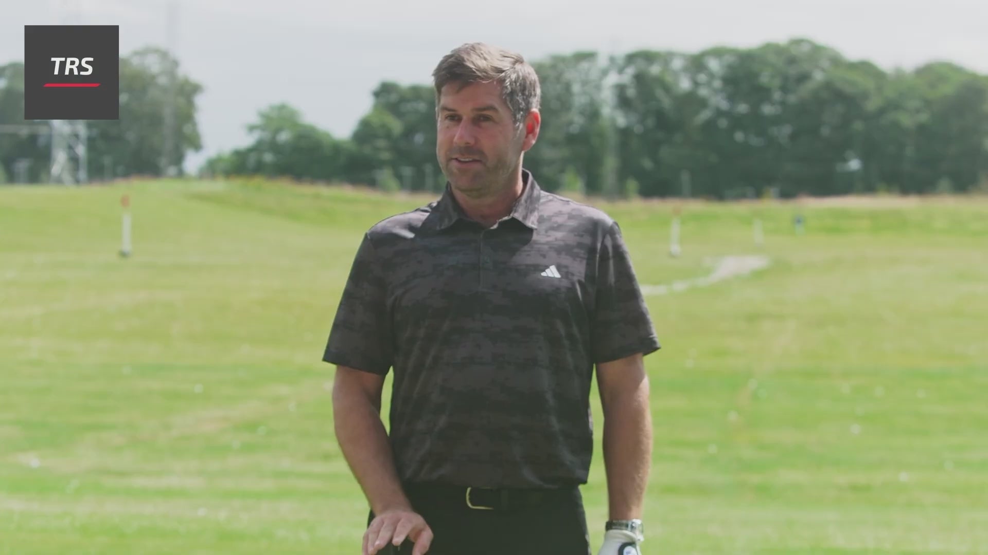
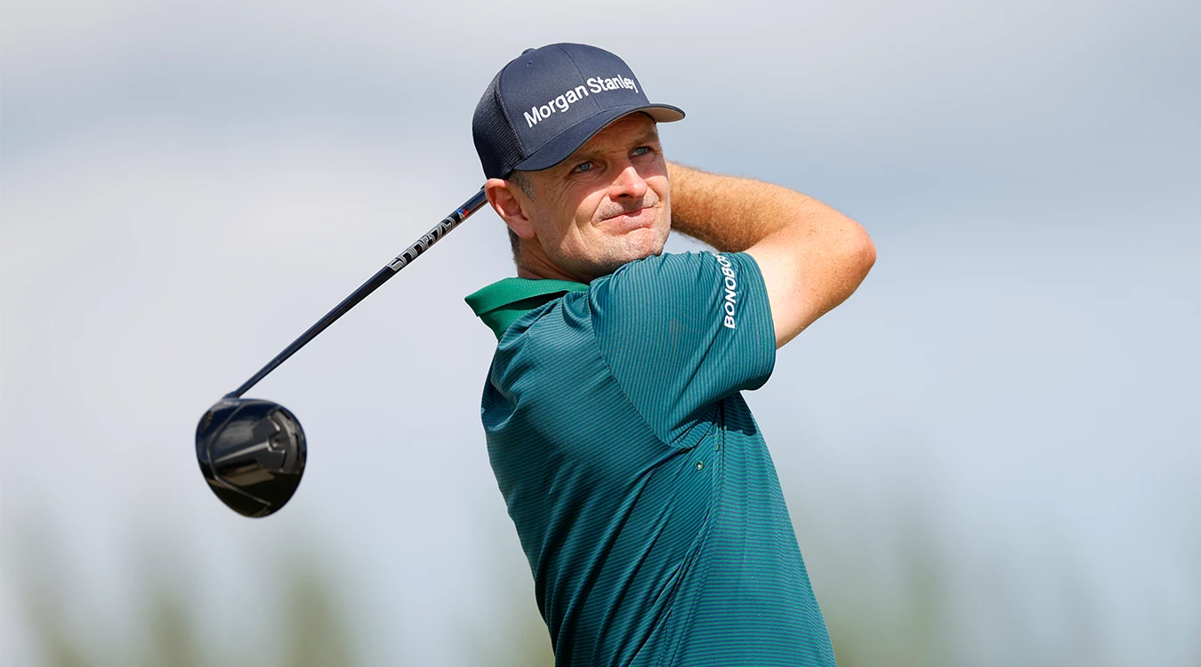
Action shot
DoBright daylight. Real golfers, real courses, mid-swing. Bright, true colour.
Don’tStudio strobes, indoor putts, monochrome filters, motion blur, vignettes.
Product cutout
DoPlain backgrounds. Single product or pack. Sharp, even lighting.
Don’tStyling props, painted backdrops, lifestyle staging, dramatic shadows.
13 / 15 — Imagery
TRS

Brand in action

The system, assembled.

50,000+ golfers · 4.8 / 5.0

TRS Slider

Designed by Robert Rock. Used on tour by Tommy Fleetwood and Cam Smith.

Product
Small Medium Large
In stock — delivered to you by January 01.
01
Eyebrow + starsAeonik 700, 14px, +16% letter-spacing, brand red.
02
H1 product nameAeonik 500, title case, −2% letter-spacing.
03
Body ledeAeonik 400, ink, no grey. Specifics over superlatives.
04
Variant pillsCapsule radius. Selected fills ink; unselected stays outline.
05
Primary CTABrand red, 2px radius, 1px #9c1827 border, uppercase.
06
Stock dotSuccess green only. Not used anywhere else.
14 / 15 — Brand in action
TRS

Files

Where to find each piece.

README.mdBrand & system reference
SKILL.mdAgent rules
colors_and_type.cssTokens & component classes
fonts/Aeonik (3 weights)
assets/Logos, icons, photography
preview/14 design-system cards
ui_kits/shop/PDP recreation
decks/foundation/This deck
15 / 15 — Files
TRS